Why Your Website Must Be Responsive in 2025
Introduction
If there’s one rule in modern web design, it’s this: your website must adapt to every screen. From smartphones and tablets to laptops and desktops, users expect websites to look and work perfectly wherever they are. Responsive design isn’t just a nice-to-have; it’s a necessity. It makes your website accessible, improves user experience, and can even impact your search engine ranking.
What Is Responsive Design?
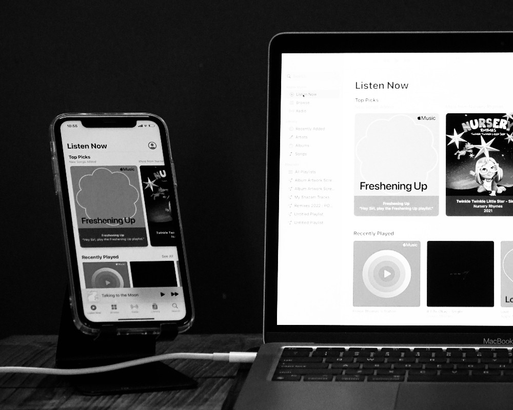
Responsive web design is the practice of building websites that automatically adjust their layout and content based on the screen size and orientation of the device being used. Instead of designing separate versions for mobile and desktop, responsive design allows a single site to provide an optimal experience for all users.

Why Responsiveness Matters for Users
Imagine trying to navigate a website that doesn’t fit your screen: text too small to read, buttons impossible to tap, content that spills off the page. Frustrating, right? Responsive design eliminates these problems. Users can easily browse, read, and interact with your site, whether they’re commuting on a phone, relaxing on a tablet, or working on a desktop.
Boosting SEO with Responsive Design
Google loves responsive websites. Sites that provide a consistent experience across devices are more likely to rank higher in search results. Why? Because they keep visitors engaged. Lower bounce rates, longer time on page, and better usability all signal to search engines that your site delivers value. Essentially, responsive design isn’t just good for people—it’s good for your visibility online too.
Business Benefits of Going Responsive
Beyond user experience and SEO, responsive design has direct benefits for businesses. Maintaining a single responsive website is easier and more cost-effective than managing multiple versions for different devices. It also ensures that your brand presentation is consistent, which builds trust and credibility with your audience.

Best Practices for Responsive Design
To get the most out of responsive design, consider these key practices:
- Use flexible grids and layouts that adjust to screen size
- Ensure images and media scale properly
- Prioritise mobile-first design to focus on the smallest screens first
- Test across a variety of devices and browsers
- Keep navigation simple and touch-friendly
Following these principles ensures your website performs beautifully for everyone, no matter how they access it.
Conclusion
In a world where people browse on the go, responsive design isn’t optional—it’s essential. It enhances usability, improves SEO, saves businesses time and money, and ensures your website delivers a consistent, professional experience on any device. Make responsiveness a priority and your visitors will thank you for it.